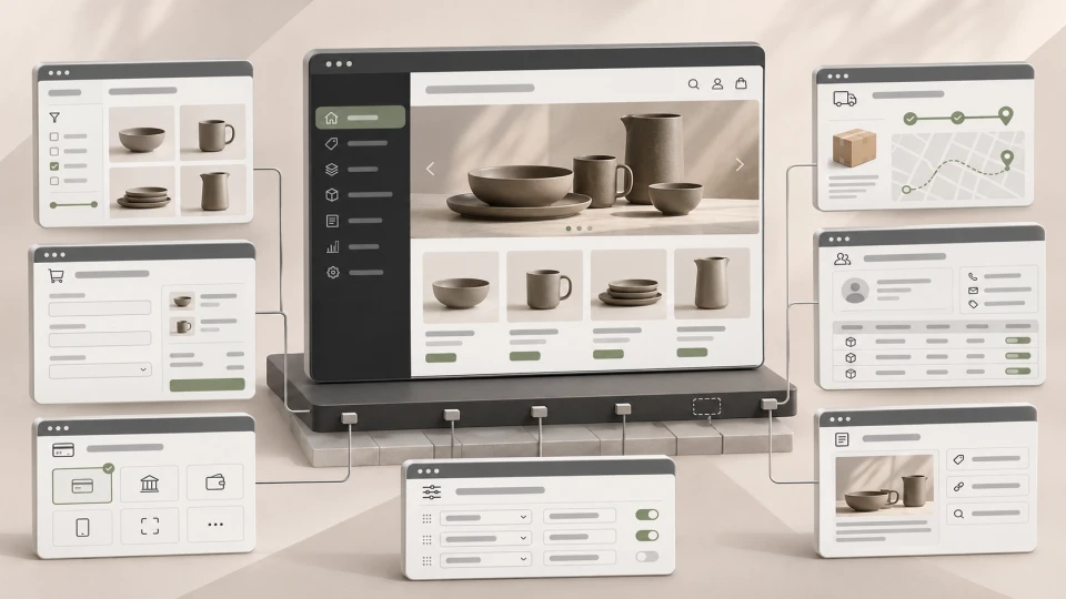
UX/UI Design That Turns Visitors into Customers
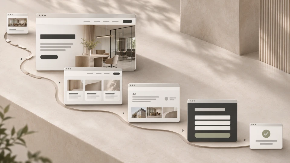
UX/UI design helps turn website visitors into customers by making the offer clearer, the user journey shorter and key actions - buying, enquiring, booking or getting in touch - easier to complete.
Good design is not just colours, fonts and a visually appealing home page.
It helps a person quickly understand:
Where am I?
What does the company offer?
Is it right for me?
Why should I trust them?
What should I do next?
If people have to search for answers to these questions, UX starts getting in the way of business results.
That is why the goal of UX/UI design is not simply:
"to look modern"
but:
to help users understand the offer and reach the desired action without unnecessary friction.
~ 13min
18/11/2026
What are UX and UI?
UX and UI are often used together, but they are not the same thing.
UX - user experience
UX, or user experience, covers how a person uses a website, online store or web application.
It includes:
- information architecture;
- navigation;
- user journeys;
- the sequence of actions;
- forms;
- checkout;
- content priorities;
- error situations;
- the mobile experience.
For example, on a service website the UX question is:
can a person understand the service and get to the enquiry?
In an online store:
can they find a product, choose a variant and complete the purchase?
UI - user interface
UI, or user interface, is how that experience is presented on screen.
It includes:
- visual hierarchy;
- typography;
- colours;
- buttons;
- forms;
- cards;
- navigation;
- components;
- spacing;
- element states;
- responsive views.
Good UI helps UX decisions become clear.
A beautiful interface with an unclear structure can still be bad UX.
On the other hand, a logical structure with an inconsistent interface can be hard to use.
How does UX/UI design affect conversion?
A conversion can be:
- a purchase;
- an enquiry;
- a phone call;
- a booking;
- a quote request;
- creating an account;
- another action that is valuable to the company.
UX/UI doesn't create demand from scratch and can't guarantee conversions.
But it can reduce the obstacles between a person's interest and their action.
For example:
the visitor is already looking for a service
→ opens the website
→ doesn't understand what the company does
→ can't find important information
→ the CTA is unclear
→ leaves.
In this case, the problem isn't necessarily a lack of traffic.
The user was already on the website.
The problem lies in what happened next.
This is exactly where UX/UI connects with conversion rate optimisation.
CRO analyses where and why users don't complete the desired action, while UX/UI helps remove those obstacles in the interface and the user journey itself.
What in UX/UI design affects results the most?
1. A clear offer on the first screen
The first screen doesn't need to tell the whole story of the company.
It needs to help a person quickly understand the essentials:
- what the company offers;
- who it is for;
- what the value is;
- what the next step is.
A weak hero:
Digital solutions for the future
It may sound good, but the user has no idea what the company actually does.
A more precise version:
ERP integrations for manufacturing companies
or:
Online store development with payment, warehouse and CRM integrations
Clarity is often more valuable than a creative but confusing slogan.
2. Information hierarchy
Users don't read a website like a Word document.
They scan.
That is why the design needs to show:
- what is most important;
- what is secondary;
- where a new topic begins;
- what is clickable;
- what the next step is.
Hierarchy is created by the order of blocks, contrast, spacing, cards, images and CTA placement.
If everything is equally important, visually nothing is important.
3. Navigation that matches the user's logic
A company's internal structure is not always a good website menu.
A customer shouldn't need to know which department provides a service or what the company calls a particular competence internally.
Navigation should reflect what the user is looking for.
For example, if someone is looking for:
SEO audit
they shouldn't have to guess whether it sits under:
Digital solutions → Marketing technology → Growth
The more interpretation the navigation requires, the more friction it creates.
4. A clear CTA
A page can have several CTAs, but they need a priority.
On a service page, the primary action might be:
Book a consultation
The secondary one:
View projects
The problem starts when these all compete equally hard on the same screen:
Buy
Sign up
Download
Learn more
Contact us
Users shouldn't have to figure out for themselves which path is meant for them.
5. Trust before asking for action
A CTA alone doesn't sell.
Before a person submits a request or pays, they often need proof.
This can be:
- completed projects;
- client reviews;
- specific results;
- certificates;
- guarantees;
- a clear process;
- delivery and return terms;
- company information.
It's important to show trust elements where doubts arise, rather than putting them all in one block at the bottom of the page.
6. Forms without unnecessary friction
Every field asks the user to do something.
That doesn't mean a form should always be as short as possible.
If the company needs information to prepare a good quote, a longer form can be justified.
But every field needs a reason.
The UX question is not:
"How many fields should the form have?"
But:
"What information is really needed at this stage of the user journey?"
7. Mobile-first thinking
Mobile design is not a shrunk-down version of the desktop page.
On a smaller screen, these change:
- information priority;
- navigation;
- forms;
- CTA placement;
- tables;
- filters;
- checkout.
That is why you need to decide:
what should the user see first on a mobile device?
This is especially important in e-commerce, bookings and enquiry forms.
8. System states and error situations
Good UX is not just the ideal scenario.
You also need to plan for situations when:
- a form is filled in incorrectly;
- a payment fails;
- a product is unavailable;
- search finds nothing;
- data is still loading;
- the user doesn't have permission to perform an action.
For example:
"Error 422"
doesn't help the user.
Better:
"Please enter a valid email address."
Good UI also helps people understand what happened after they took an action.
UX/UI in e-commerce
In an online store, UX directly affects the buying process.
What matters:
- categories and filters;
- product cards;
- product information;
- variant selection;
- price;
- delivery information;
- availability;
- the cart;
- checkout;
- payments;
- the mobile experience.
For example, a user may be ready to buy but abandon checkout if they only discover at the very end that:
delivery costs €12
or:
their preferred payment method isn't available.
This isn't just a design problem.
It's an information and buying process problem that UX/UI needs to be able to solve.
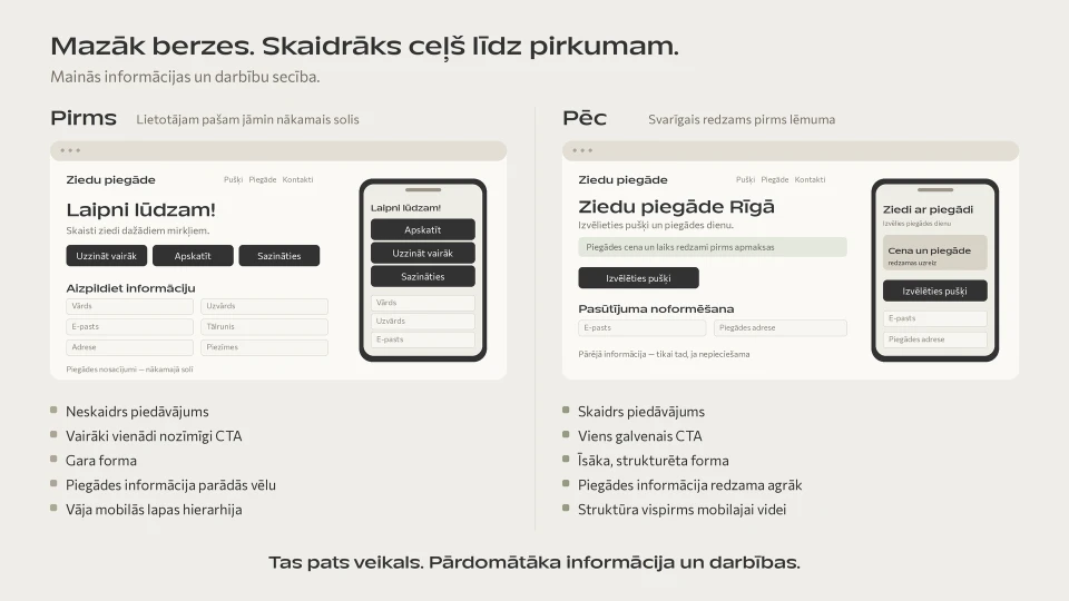
A real example: Flowersexpress.lv checkout
In the Flowersexpress project, UX/UI work didn't start with choosing a new button colour.
First, we analysed:
- Google Analytics data;
- user behaviour in Hotjar;
- clicks;
- session recordings;
- mobile usage;
- the checkout structure.
In the new checkout concept, we:
- shortened and restructured the form;
- improved field grouping;
- revised the delivery information;
- reordered the payment methods;
- made the order summary more visible;
- paid particular attention to the mobile experience.
It's a good example of what the UX/UI process looks like in practice:
data → problem → hypothesis → new user journey → design
rather than:
"the old design looks outdated → let's make it more modern".
UX/UI on service websites
A service website usually has no checkout.
But there is still a conversion path.
For example:
Google → service page → understanding → trust → projects → enquiry
The UX problem may be:
- an unclear service description;
- it's not clear who the service is for;
- no project examples;
- the process isn't explained;
- the CTA is hard to notice;
- the form asks for too much information.
Good UX helps the user gradually get the information they need to make a decision.
A real example: Rīgas Ūdens UX/UI audit
In the Rīgas Ūdens project, we analysed the existing website's:
- structure;
- navigation;
- user flows;
- content clarity;
- interactive elements;
- mobile experience;
- digital accessibility.
After the audit, the most important functions were visually prioritised in the new prototype.
For example:
- the customer portal;
- reporting faults;
- the map of current works;
- search;
- contact information.
Here, the UX task wasn't to "drive more purchases".
The goal was:
to help people find the information they need faster and complete an important action.
This shows that in a UX context, a conversion is not only an e-commerce purchase.
UX/UI audit or a full redesign?
Not every problem needs a new website.
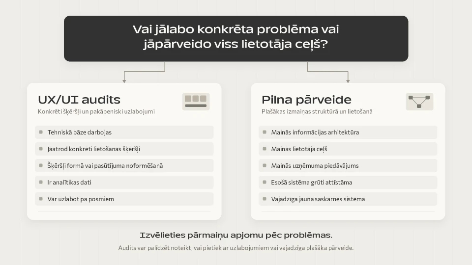
| UX/UI audit | Full UX/UI redesign |
|---|---|
| The existing site already has a good technical base | The structure changes significantly |
| You need to find specific conversion obstacles | User journeys change |
| The problem is checkout, a form or a specific section | The offer or information architecture changes |
| There is data to analyse | The existing design is hard to develop further |
| Improvements can be rolled out in stages | A new design system is needed |
For example, if an online store's only problem is checkout, there's no need to redesign the home page, the product catalogue and the whole brand.
On the other hand, if people don't understand what the company offers from the home page, adjusting one checkout button won't solve anything.
How to find UX problems?
A good UX/UI audit is not just an expert's opinion:
"I think this button should be bigger."
If data is available, you also need to look at user behaviour.
Analytics
For example:
- which pages people visit;
- where they leave;
- how many start a form;
- how many complete checkout;
- how desktop and mobile results differ.
Session recordings
They can show:
- repeated clicks;
- confusing elements;
- going back to a previous step;
- problems in the mobile view;
- places where users stop.
Heatmaps
They can help you understand:
- where people click;
- how far they scroll;
- whether important elements are noticed.
Customer and support questions
If customers regularly ask:
"How much is delivery?"
"Where can I sign up?"
"Do you work with businesses?"
the information on the website is probably not clear enough.
User testing
Sometimes it's enough to watch a person try to complete one specific task.
For example:
"Find out how to report a fault."
or:
"Buy this product with delivery to a parcel locker."
Where someone stops or makes a mistake often tells you a lot about the UX.
UX/UI in web applications
In web applications, users often have different roles, dashboards, statuses, tables and multi-step actions.
That's why the most important question is:
what is this specific user trying to do?
An administrator, a customer and an employee can have completely different goals in the same system.
That's why web application UX starts with user roles and scenarios, not with drawing screens in Figma.
How does the UX/UI design process work?
A good process starts before the visual design.
1. We define the goal
We identify the audience, the business goal, the most important user actions and existing problems.
2. We analyse and structure
In an existing project, we analyse user behaviour and current flows.
In a new project, we build the information architecture and user journeys.
3. We prototype
Before detailed visual design, we test the order of blocks, screens and actions.
4. We build the UI system
We define components, forms, typography, colours, spacing, states and responsive views.
5. We hand over and test
The developer needs to be clear on how components behave and how the solution works across devices and states.
Read more about Brandsite's approach in our web design and UX/UI audit service.
What can't good UX/UI solve?
Not every low conversion rate is a design problem.
UX/UI can't fully make up for:
- a product the market doesn't want;
- the wrong audience;
- an uncompetitive price;
- a weak offer;
- poor customer service;
- an untrustworthy company;
- low-quality traffic.
For example:
if an ad promises "an online store from €500", but on the website the service starts at €5,000, a high drop-off may not be a UX mistake.
The problem is the mismatch between the ad and the offer.
That's why good UX/UI work doesn't start with the assumption:
"the design is to blame."
It starts with the question:
"where exactly in the user journey does the problem occur, and why?"
A practical UX/UI checklist
First screen
- Can you understand what the company offers within 5-10 seconds?
- Is it clear who the offer is for?
- Is the next step visible?
Structure
- Are the main pages easy to find?
- Are the menu labels clear to the customer?
- Is information ordered by priority?
Trust
- Are there projects, reviews or other proof?
- Does important information appear before the user has to make a decision?
CTA
- Is the main action clear?
- Are there too many equally important CTAs in one place?
- Does the CTA text explain what happens next?
Forms
- Is every required field really necessary?
- Are error messages clear?
- Is the form easy to fill in on a phone?
Mobile
- Is the most important content visible early enough?
- Are buttons and forms easy to use?
- Are there no unnecessarily long blocks or horizontal scrolling problems?
E-commerce
- Are price and availability visible?
- Are delivery terms clear?
- Is it easy to choose product variants?
- Does checkout avoid unnecessary steps?
If the answer to several questions is "no", the problem may not be that you need more traffic.
Some of your existing traffic is simply running into too much friction.
Frequently asked questions
What is UX/UI design?
UX/UI design is the design of the user experience and the digital interface.
UX defines the structure, user journeys and the logic of actions, while UI turns that experience into a visual, clear and consistent interface.
What is the difference between UX and UI?
UX focuses on how the user achieves their goal.
UI focuses on the visual and interactive implementation of the interface.
In practice, the two are closely linked.
Does a more beautiful design increase conversions?
Not necessarily.
Visual quality can increase trust, but conversion is also affected by the clarity of the offer, navigation, content, forms, prices and the process.
That's why UX/UI improvements should solve specific user problems, not just change the visual style.
When do you need a UX/UI audit?
A UX/UI audit is especially useful when there is already traffic, but people:
- don't complete purchases;
- don't fill in enquiry forms;
- can't find important information;
- stop at a particular stage of the process.
Do you need to redesign the whole website?
Not always.
Improvements can also be made to a specific:
- checkout;
- product page type;
- service page;
- form;
- home page;
- web application module.
How do you measure the results of UX/UI improvements?
Depending on the project, you can assess:
- conversion rate;
- number of completed purchases;
- form completions;
- checkout drop-off;
- number of errors;
- completion of specific actions;
- user testing results.
The metric should be chosen based on the goal of the specific UX/UI work.
Summary
Good UX/UI design doesn't try to talk the user into something. It helps them understand and act.
It brings order to:
offer → information → user journey → trust → action
UX/UI is not just the visual finishing touch of a project.
It affects whether a person:
- understands the offer;
- finds what they need;
- trusts the company;
- can complete a purchase or enquiry.
The main principle is simple:
good UX/UI reduces confusion and friction between users and their goals.
Latest articles
Website Development Process: From Idea to Launch
From Expert Knowledge to a Digital Product Platform: The HICE Group Case
7 E-commerce Automations That Help Win Back Customers and Increase Sales