Checkout Analysis & Optimization
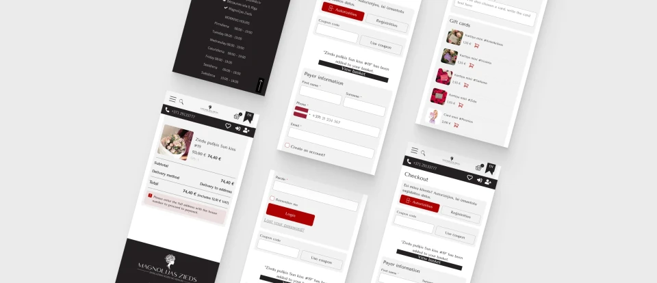
Before developing the new design, Flowersexpress.lv user behavior and checkout performance were analyzed using Google Analytics and Hotjar data. Session recordings, clicks, and user flows helped identify key optimization opportunities, with a strong focus on the mobile experience.
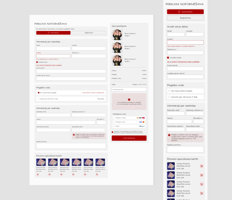
Based on the findings, the checkout form structure, delivery and payment information, validation messages, and order summary were improved. The goal was to create a shorter, clearer, and more user-friendly checkout experience.
Based on the findings, the checkout form structure, delivery and payment information, validation messages, and order summary were improved. The goal was to create a shorter, clearer, and more user-friendly checkout experience.
- Technology
- E-commerceWebsiteWordPress
- Task
- Back-endFront-endStrategyUI/UX
- Team
- KristineKristapsSigne
- Development duration
- 2 weeks Live website
Custom Checkout Administration System
As part of the project, a custom checkout management system was developed, allowing checkout functionality and delivery conditions to be managed directly from the WordPress admin panel.
The system automatically calculates delivery costs based on the customer’s address and distance. Administrators can configure distance ranges, delivery fees, and free delivery thresholds.
Delivery times can also be managed for weekdays and weekends, with custom delivery intervals available for specific dates, such as public holidays.
Additional checkout options, including gift cards, gift wrapping, and local pickup, can be enabled or disabled as needed. A logging system was also implemented to track delivery calculations and changes made within the admin panel.
The system automatically calculates delivery costs based on the customer’s address and distance. Administrators can configure distance ranges, delivery fees, and free delivery thresholds.
Delivery times can also be managed for weekdays and weekends, with custom delivery intervals available for specific dates, such as public holidays.
Additional checkout options, including gift cards, gift wrapping, and local pickup, can be enabled or disabled as needed. A logging system was also implemented to track delivery calculations and changes made within the admin panel.
Before and after
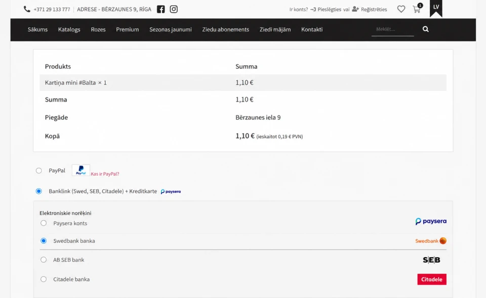
Based on the analysis results, a new checkout design concept was created in Figma to provide a brighter, visually cleaner, and more intuitive checkout process, with particular attention to the mobile user experience.

User Experience
The project resulted in a data-driven checkout improvement strategy based on real user behavior analysis. This approach allowed design decisions to be made using actual usage patterns and identified friction points rather than assumptions.
As a result, a modern checkout design solution was created with the goal of reducing checkout abandonment, improving the mobile user experience, and increasing overall conversion rates.
As a result, a modern checkout design solution was created with the goal of reducing checkout abandonment, improving the mobile user experience, and increasing overall conversion rates.

Some of our
projects
130+ completed projects - from corporate websites and online stores to web applications and business systems with integrations. Each solution is developed individually around a clear business challenge.
See portfolio